CATCH A CAT
MY ROLE
Visual Design Lead
UIUX Designer
UX Researcher
OVERVIEW
designer
Elaine Zeng
Ming Huang
Yongkang Yu
Xinjin Xu
The current CAT website still has room for improvement in terms of information hierarchy and user experience. As user needs continue to evolve, iterating and updating the website has become a crucial step to enhance service quality and user satisfaction. Thus, the "CHATHAM AREA TRANSIT" (CAT) website is being redesigned to enhance user experience, providing a modern, accessible platform for purchasing bus tickets, checking routes, and accessing essential transit information.
SUMMARY
Currently, CAT is working hard to improve its operational efficiency and service quality to adapt to changing transportation needs. Thus, a convenient user experience in ticket purchasing is highly important. The current CAT website still has room for improvement in terms of information hierarchy and user experience. As user needs continue to evolve, iterating and updating the website has become a crucial step to enhance service quality and user satisfaction.
How might we enhance clarity, accessibility, and engagement by improving ticket information, payment systems, promotional communication, and visual design to better support user decision-making and navigation?
OPPORTUNITY
Optimizing clarity, prioritizing content, enhancing navigation, reducing cognitive load, improving user engagement
STRATEGY
Simplifying navigation bar, enhance route search, clarify button design, and ensure consistency with the homepage
OBJECTIVE
Creating a seamless and inclusive transit experience with redesigning for ease, speed, and accessibility
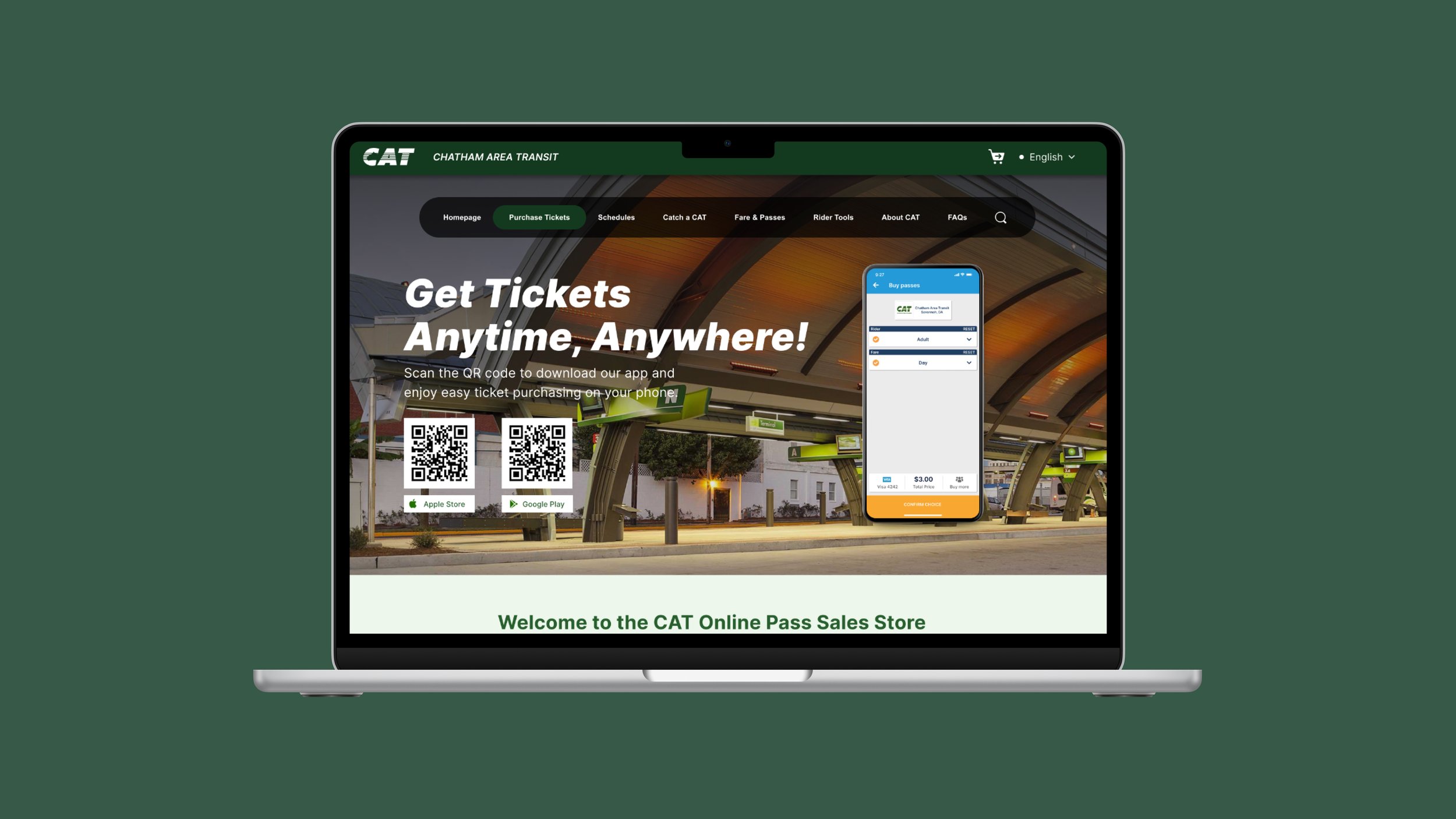
CORE EXPERIENCES - TICKET PAGE


DEEP DIVE - TICKET PAGE
The Hero Page:
Combining it with the bus card design and slogan allows users to better identify the information and topic of this page.
APP Download Section:
Separating the promotional hero page from the app download introduction allows users to better distinguish between different types of information.
In the app download section of the hero page, we added a down-scroll indicator to inform users that additional information is available by scrolling further down.
Ticket Categories Section:
We added a filter tool and re-designed the visuality of the ticket. This approach allows users to easily navigate ticket options while enjoying a refined and cohesive visual style.
Information Details:
Based on user feedback indicating a preference to see ticket purchase options immediately upon accessing the Ticket page rather than introductory information on purchase methods or contact details, we relocated the introductory section below the Ticket Categories. This adjustment helps users quickly find the purchase guidance they need.


CORE EXPERIENCES - home PAGE


DEEP DIVE - home PAGE
Header:
The Hero page enhances the prominence of the navigation bar and makes the search function more noticeable for users.
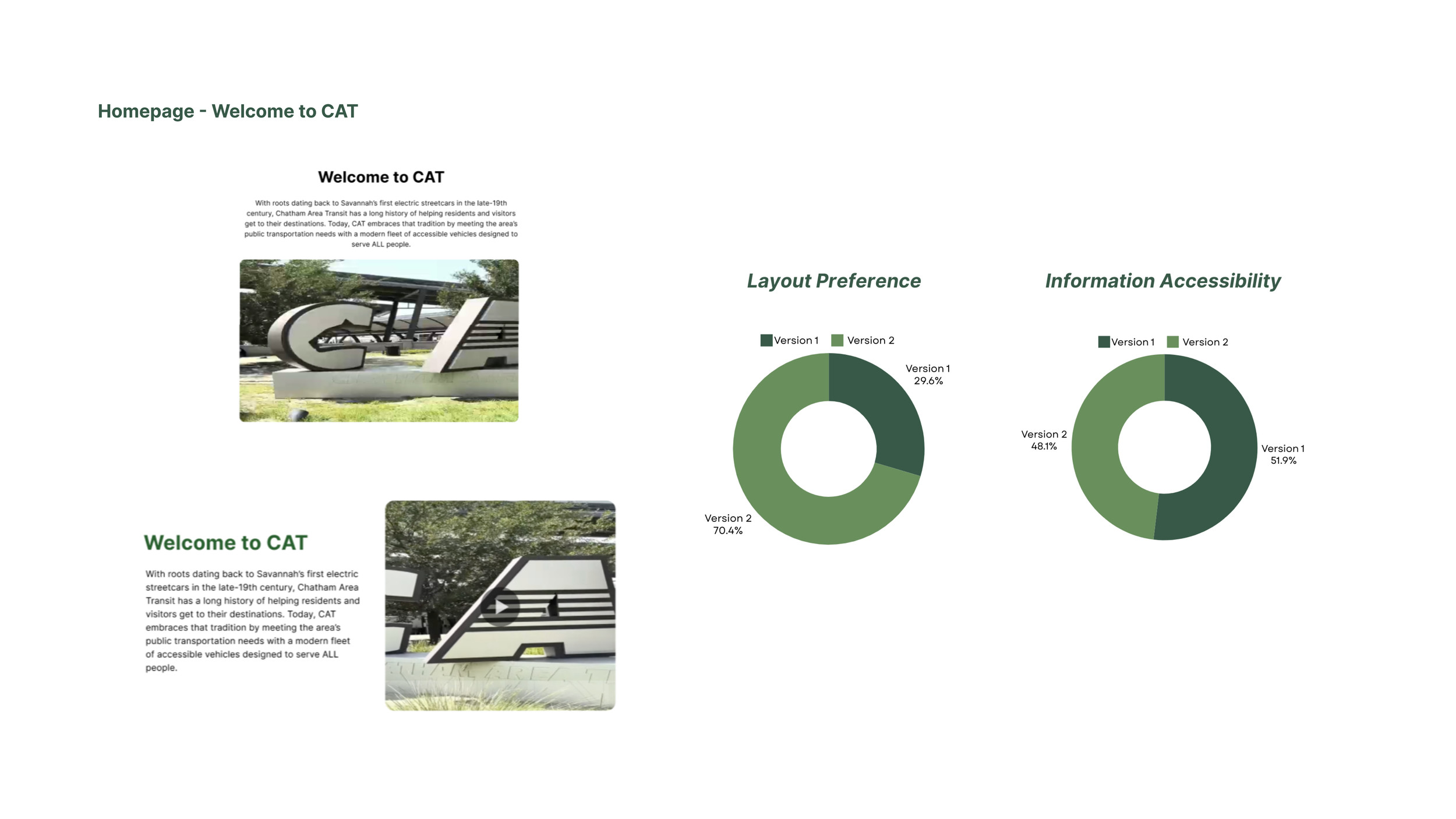
Welcome Page:
The more compact text layout allows users to quickly read through the introductory section at a glance.
Main Features:
We clearly indicate that these four features are clickable, guiding users to access more content. And separating the background between the top and bottom sections.
Plan My Trip:
As more users expressed a preference for the Google Maps-style UI, which they found familiar and easy to use. This choice minimizes learning time and makes the feature more intuitive.
CAT Services:
The shadow color of the CAT Service section was adjusted to match the theme color, creating a more cohesive visual alignment with the overall design.
Did You Know?
A visual cue that allows users to gauge how much content remains as they scroll. This feature helps users feel oriented and encourages them to explore additional information.
News & Updates:
We differentiated colors for “Information Type” and “Information Links,” making it easier for users to understand and navigate the content at a glance.
Footer:
Allowing users to directly navigate to the ticket purchasing page and follow CAT’s social media channels. This integration offers quick access to key actions right from the footer, enhancing user convenience and connectivity.


THE PROCESS
1. Research
We conducted an in-depth analysis of the Chatham Area Transit (CAT) official website and identified areas for improvement in user experience, information architecture, and accessibility. Based on user research and industry best practices, we have developed an iteration strategy to enhance the website's usability and functionality.


2. Brainstorming, Designing, and Iterating
To gain a clear understanding of the current website’s challenges, we conducted a preliminary study with 10 participants. This research allowed us to identify key usability issues and gather valuable user insights that guided our initial iteration goals. Based on the feedback, we also refined the target audience segments, achieving a more precise age-based classification to better tailor our design improvements.


3. Two Versions of High-Fidelity
We created two design versions for both the homepage and the ticket product page to explore different approaches to enhance user experience. Each version presents unique layouts, navigation flows, and visual elements tailored to improve accessibility, highlight ticket options, and ensure an intuitive browsing experience. By comparing these versions, we aim to identify the most effective design strategies to guide users seamlessly through the process of purchasing tickets and accessing essential transit information.


4. User Testings
Our user testing focuses on two key aspects: 1)Visual Preference and 2) Purchasing Experience
Visuality Survey:
We engaged 27 users to evaluate and select their preferred visual design between the two versions.
Collected valuable insights into user preferences.
Gathered specific feedback on appealing and effective design elements.
Used feedback to refine design choices to better align with user expectations.
Aimed to enhance overall user experience based on user input.


Ticket Categories:
Filter feature: Deemed unnecessary due to limited ticket types.
Hover effect for purchasing tickets: This should display additional information.
Discounts: Highlight by displaying new prices in red.
Half Fare discount icon in Version 2: Needs accompanying text for clarity.


A / B Testing:
We conducted 13 participants aged 20-35 (students & designers) to gather feedback on task flows for our itinerary website.
Collected feedback on task flows for the itinerary website.
Gained insights into usability and functionality from a diverse user group.
Evaluated navigation, task completion, and overall user experience.
Used real user feedback to make targeted design improvements.


Header:
Scroll guidance design
Add shadows for contrast
Did You Know Section- Move higher on the page
News and Update section - Change the icon
Footer design - Optimize for clearer hierarchy
Route Search:
Display the closest bus line near the user.
Indicate how far the bus is from the user’s location.
Outline the areas the bus will travel across.
Product Page:
Mobile ticket purchase guidance: Overshadowed website option, hard to find (appeared after three scrolls).
User misconception: Believed a mobile device was needed; clarify by positioning app download prompt below ticket options.
Excessive text: Need for more concise information.
Checkout:
The "Confirm Pickup" buttons still require scrolling to access.


User Feedback:
During our A/B testing, user feedback highlighted both positive expectations and areas for improvement in each version. Based on the majority of feedback, we integrated the strengths of both versions to create an optimized iteration.


Homepage:
Adjusting the size, color, and functional order of the navigation bar, changing it from two rows to one.
Keeping the background image but will consider reducing its size. The aim is to create space for guiding users to scroll down and see the primary functions (which contain the most important information for them) directly, rather than searching through the navigation bar.
Route Search:
Enlarging the route search feature on the left to display more information simultaneously, possibly referencing the Google Maps UI or linking directly to Google Maps.
Redesigning the right side as buttons to enhance clarity.
Ticket Purchase:
Redesigning to keep the navigation bar consistent with the homepage for easy return and access to other features.
Mobile Ticketing Information:
Adding a QR code image for APP download, making it more eye-catching and convenient.
Ticket Types:
Some interviewees expressed a preference to browse detailed information about all ticket types on this page rather than having to click on each ticket individually to avoid repetitive clicking.


REFLECTION
With the guidance from Professor Denise Ranghetti do Pilar and the collaboration of team members, in the process of iterating the ticket purchase process on the Chatham Area Transit website, I deeply realized the value of user feedback for optimizing design. Through data analysis and A/B testing, we accurately identified user pain points and improved ticket purchase efficiency by reducing operation steps and optimizing interface layout.
At the same time, this project also made me understand the importance of cross-functional team collaboration and continuous iteration. From user needs to the final solution, we constantly adjusted to ensure the best experience.
In addition, we paid special attention to barrier-free optimization to make the ticket purchase process more inclusive and easy to use. This practice made me realize that excellent user experience is not only about visual design but also about continuous improvement based on real needs.

